person

Case Study: Optimizing Northrop Grumman"s SharePoint UX/UI for Desktop

Role: Front End UI/UX Design
Company: Northrop Grumman Corporation
Duration: June 2018 - November 2020
Scope: Modernize the SharePoint desktop experience by improving UI components, navigation, and interactivity while ensuring alignment with security protocols and brand guidelines. The goal was to streamline workflows, enhance usability, and optimize document management for internal teams.
Technologies Used: Microsoft SharePoint, XML, ASPX, JavaScript, jQuery, HTML, CSS, Style Guide Sheets, A/B testing, Backend Development

Challenges & Objectives

Key Challenges:

• Outdated Interface: The existing SharePoint design was cluttered and difficult to navigate.
• Inefficient Workflows: Users struggled with document management and team collaboration.
• Legacy System Constraints: The ASPX-based infrastructure limited flexibility for modern UI/UX enhancements.
• Limited Interactivity: Frequent page reloads slowed workflows.
• Accessibility Issues: No dark mode or compliance with accessibility best practices.


Objectives:

• Modernize UI – Enhance aesthetics while maintaining consistency.
• Optimize Navigation – Introduce intuitive menu structures and quick-access features.
• Improve Workflow Efficiency – Reduce friction in document approvals and collaboration.
• Enhance Accessibility – Implement features like dark mode and improved contrast.
• Standardize UI Components – Develop a reusable design system for scalability.


My Role & Contributions:

As a UI/UX Designer & Front-End Developer, I was responsible for:
• Wireframing & Prototyping: Created interactive prototypes for stakeholder approval.
• UI Redesign: Enhanced SharePoint’s usability with a modern, cohesive interface.
• A/B Testing & Iteration: Validated design decisions with user feedback.
• Collaboration: Worked closely with engineers and security teams to meet defense-sector standards.


Look & Feel of the Design

The design aimed to create a visually modern and intuitive user experience while adhering to Northrop Grumman’s brand identity and security standards.

• Stakeholder Engagement: I facilitated regular discussions with business stakeholders from different departments, including marketing, operations, and finance, to gather their requirements. This ensured that the design would support the diverse needs of internal users, making the tool adaptable to various roles within the company.

team member

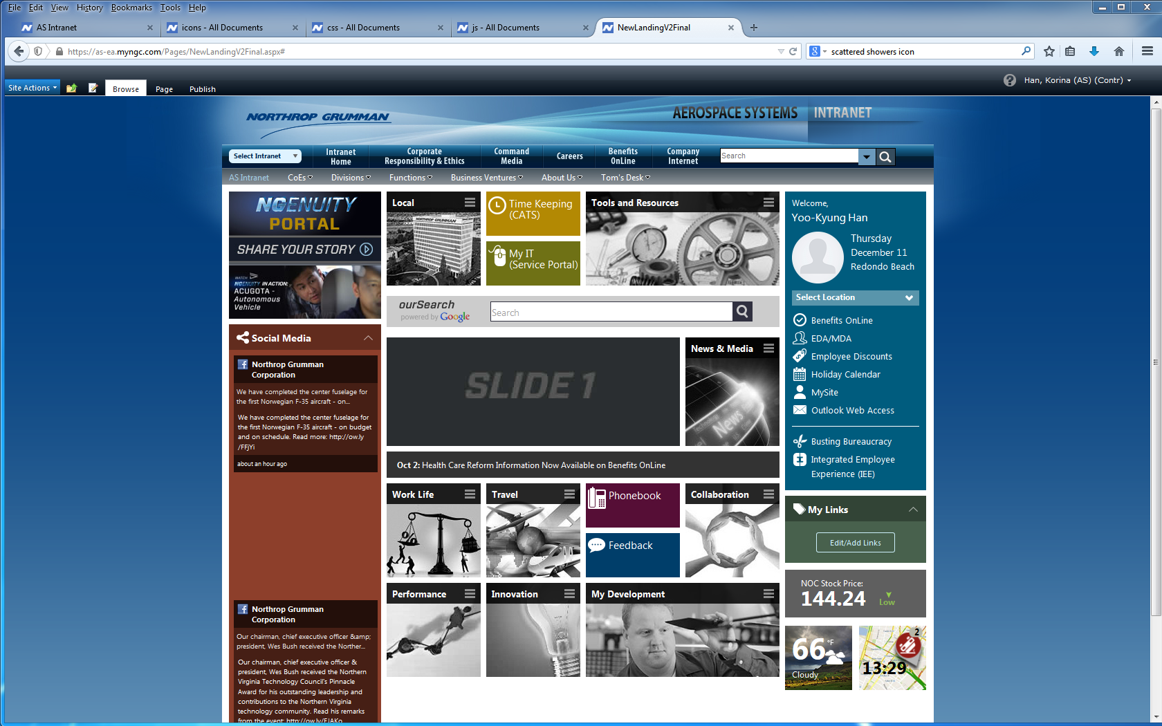
1. Visual Aesthetics & Branding:

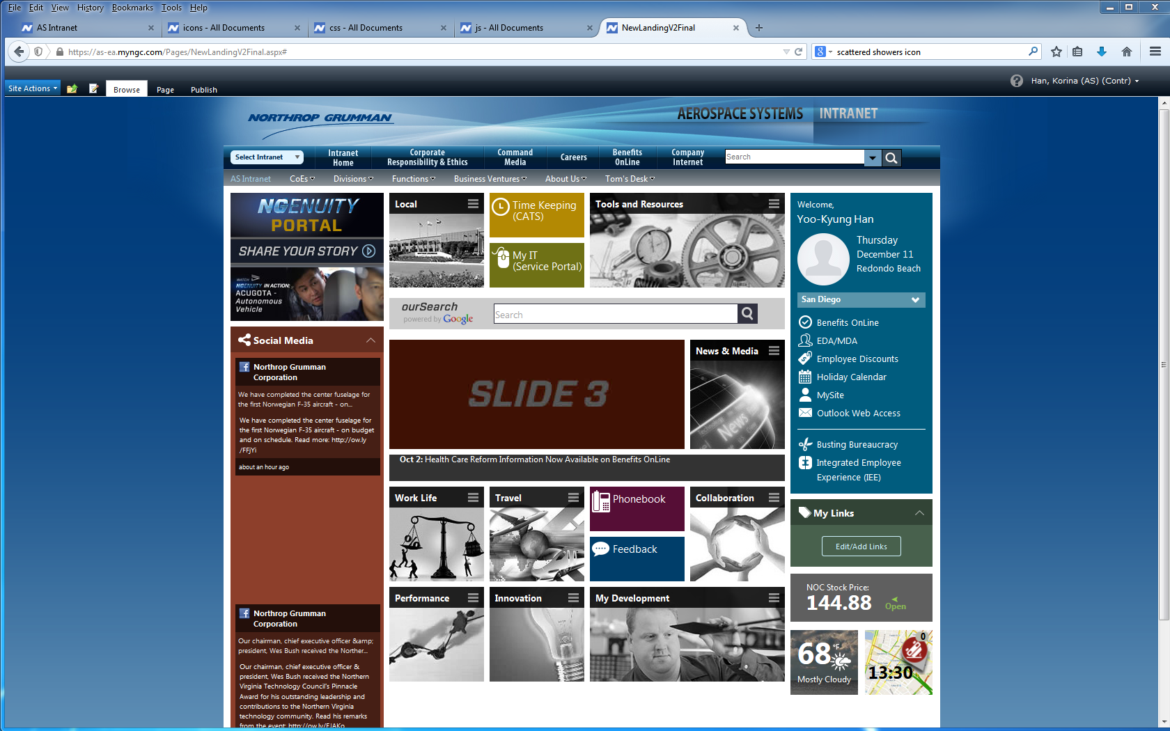
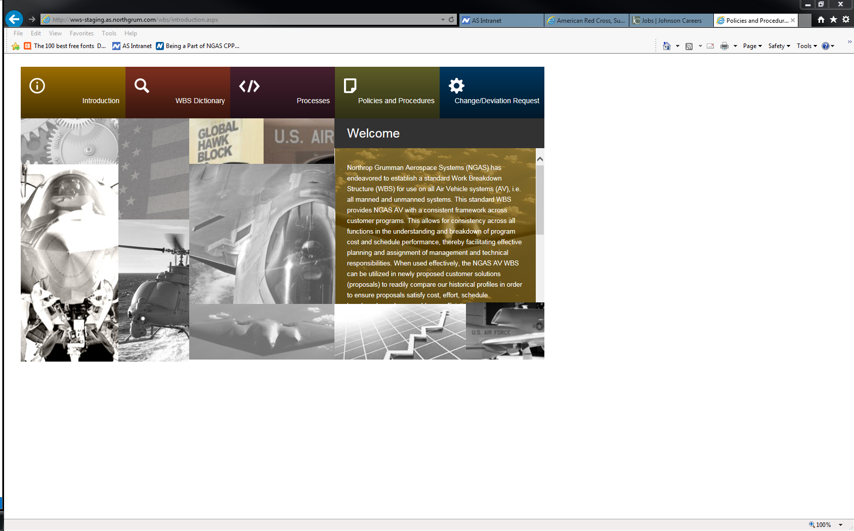
The UI design was refreshed with a sleek, minimalistic style focused on clarity. We used Northrop Grumman"s official color palette (blues, green, and whites) to ensure the interface was on-brand while maintaining a professional, clean look. Typography was chosen for readability and consistency, with a focus on legibility across multiple screen sizes. High-contrast visuals were implemented, particularly for text and background colors, to improve accessibility and ensure readability in different lighting conditions.


2. Interactive Features & Flow:

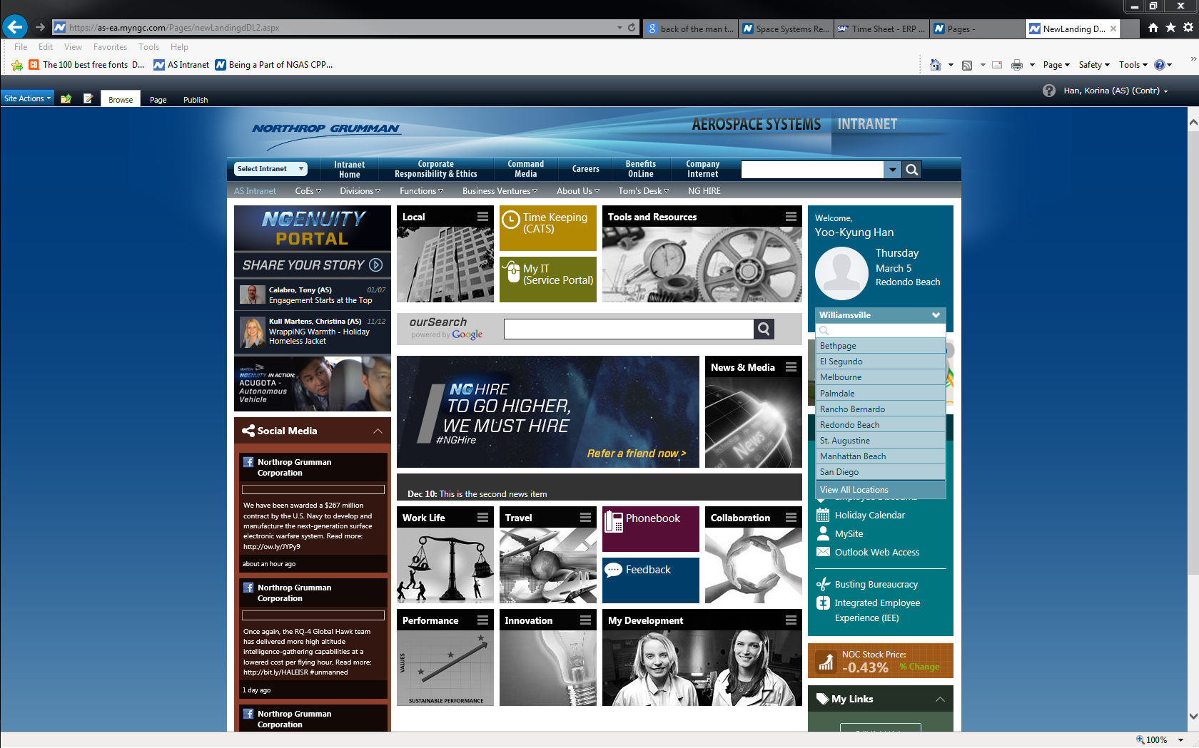
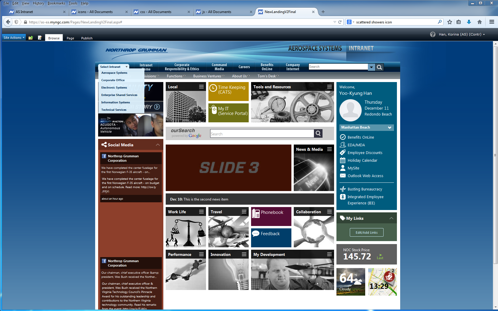
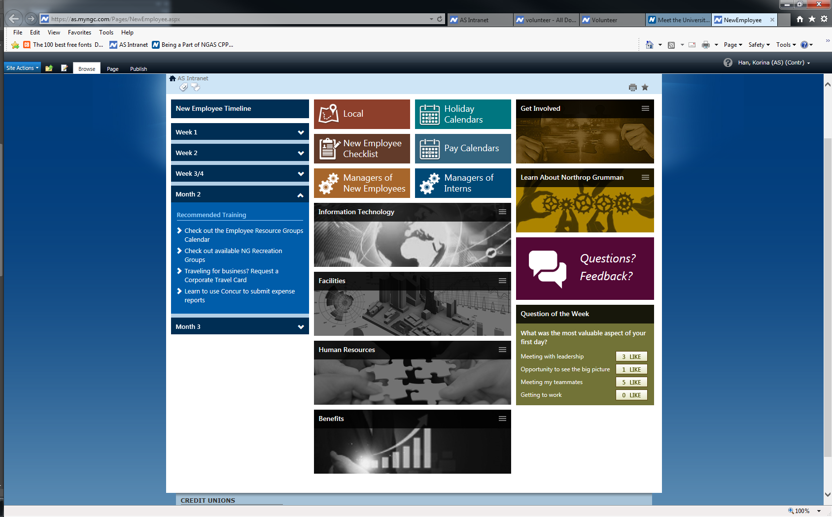
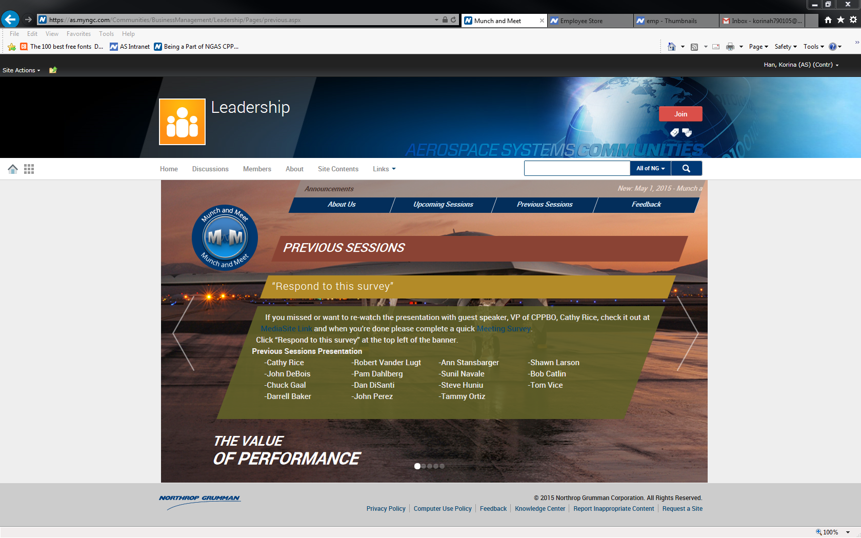
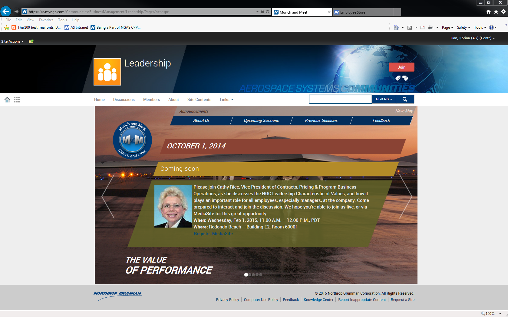
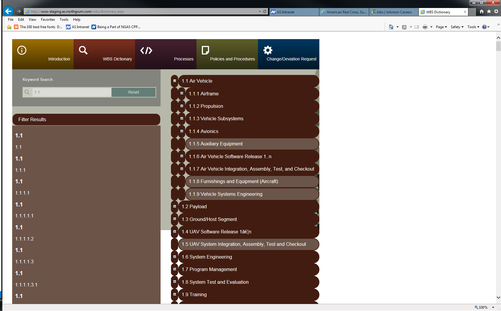
The navigation bar was simplified and streamlined for easier access to key areas, reducing user friction. The left sidebar provided a persistent menu, keeping crucial tools just one click away. Implemented a dark mode toggle, allowing users to choose their preferred theme and enhance overall readability and comfort. 
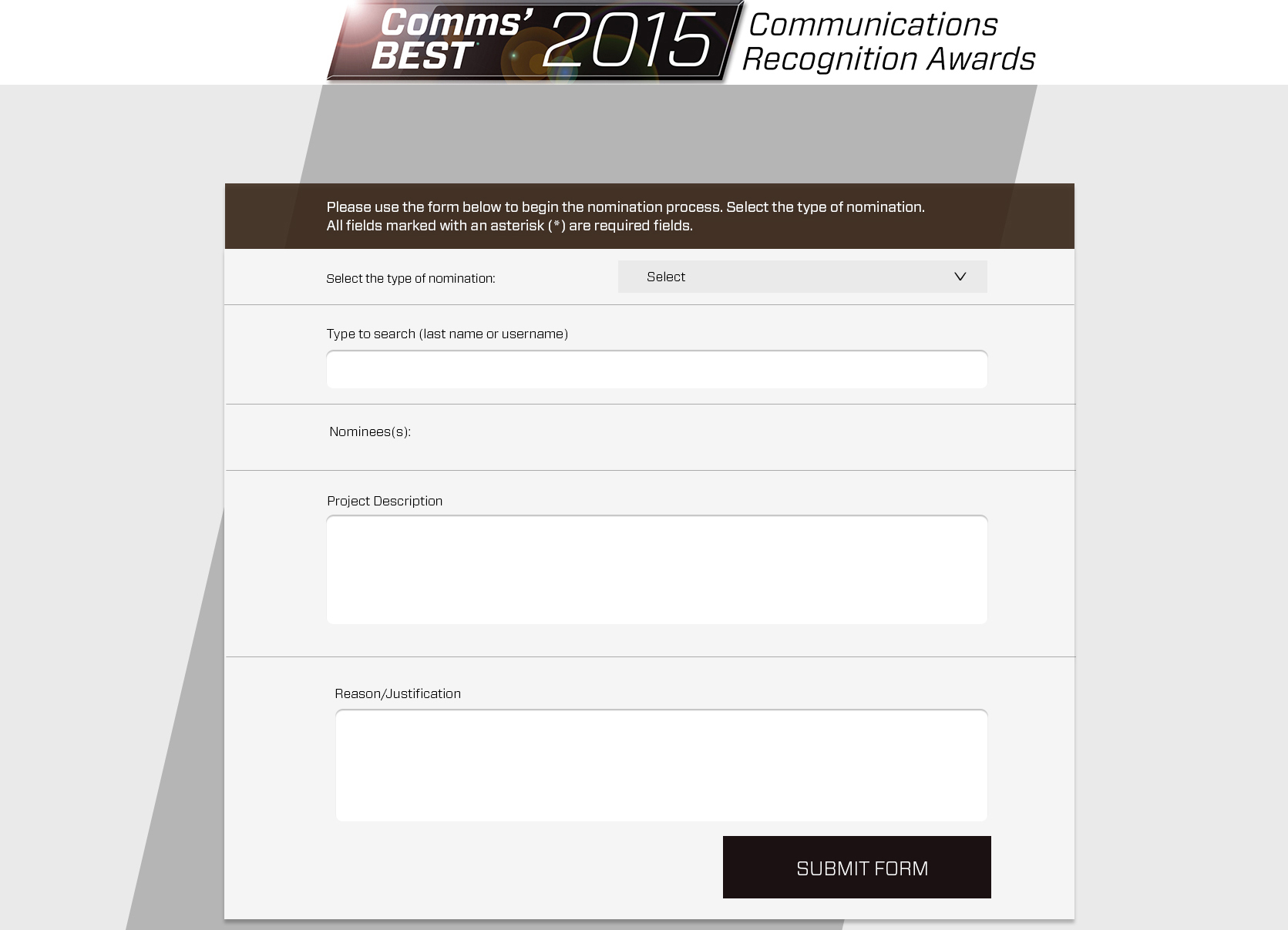
Interactive components, like floating labels on forms and real-time form validation, gave users immediate feedback and reduced errors, improving the overall user experience.


3. Layout & Design Systems:

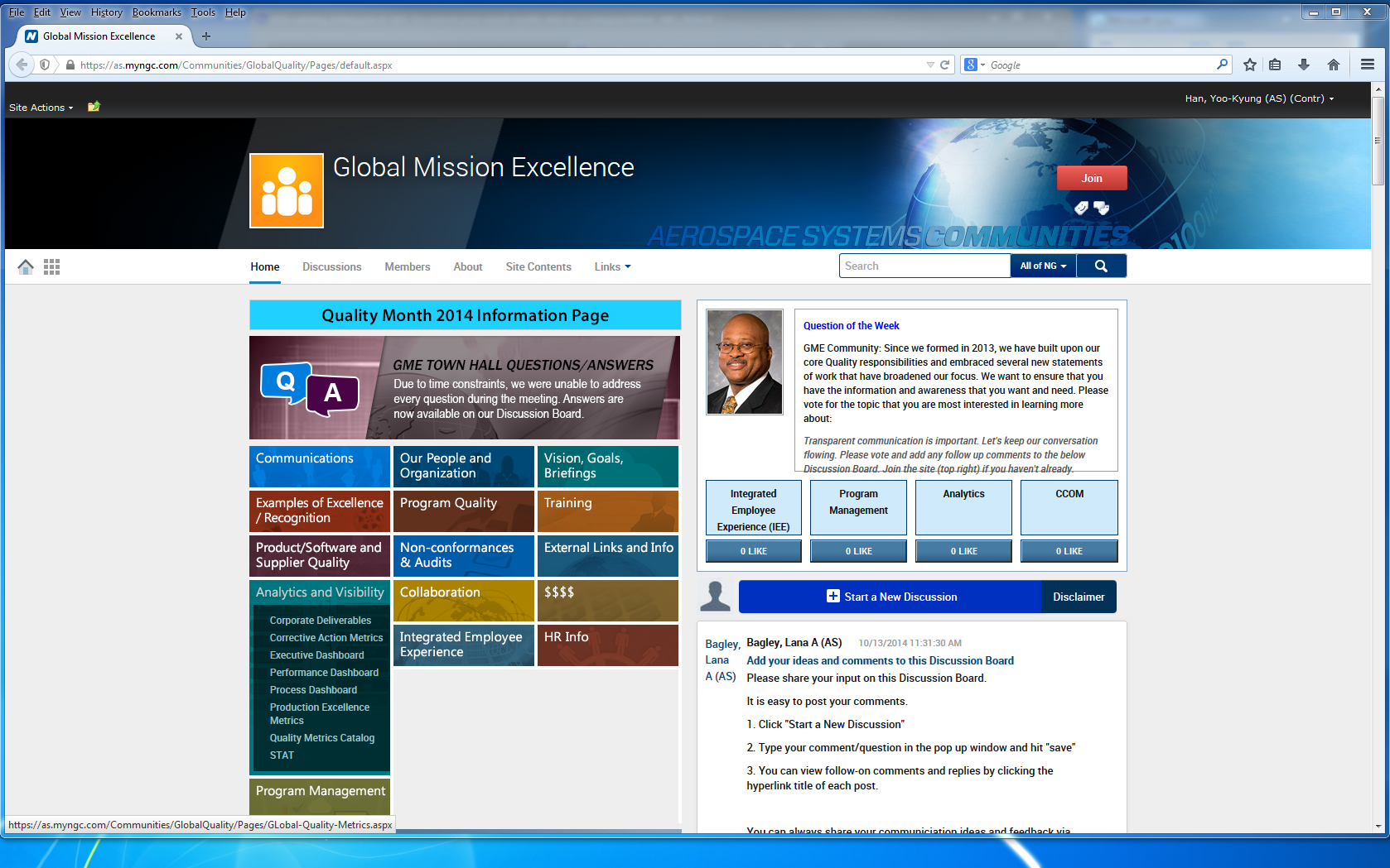
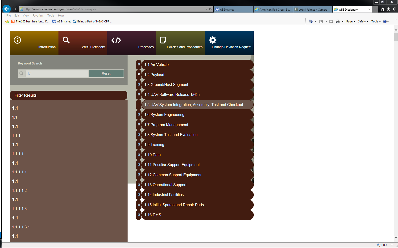
Introduced a modular design system where reusable UI components (buttons, forms, tables) followed consistent guidelines, creating uniformity across the platform. Grid-based layouts were used to organize content in a structured manner, ensuring that everything from documents to menu items felt well-organized and easy to find. Clear hierarchy and visual cues such as color coding and icons helped users prioritize actions effectively, improving usability and reducing cognitive load.


4. Animations & Transitions:

Subtle micro-interactions were added to improve user engagement. For example, hover effects on buttons and quick animation for the dark mode toggle made the experience feel more dynamic and interactive. Transitions between pages were made smoother with AJAX-powered content loading, eliminating the need for full-page reloads and ensuring a fluid, seamless navigation experience.


Solution Implementation

1. UI/UX Design & Wireframing

Designed wireframes and interactive prototypes to visualize improvements.Ensured compliance with Northrop’s branding and security protocols. Conducted iterative reviews with stakeholders to refine the final design.

2. Interactive Features & Flow:

2. Improved Navigation & LayoutIntroduced a fixed left sidebar for seamless navigation. Developed a quick links panel for frequently accessed features. Enhanced search and filtering for faster document discovery.

3. Enhanced UI Components

Developed a style guide with reusable UI components (buttons, forms, alerts). Introduced floating label forms for better usability. Added a dark mode toggle to improve readability and accessibility.

4. Interactive Features with JavaScript & jQuery

Implemented AJAX-powered content loading to reduce full-page reloads. Enhanced real-time form validation with jQuery. Created sortable/filterable tables for efficient data management. Developed a live notifications system for document approvals.

4. Interactive Features with JavaScript & jQuery

Implemented AJAX-powered content loading to reduce full-page reloads. Enhanced real-time form validation with jQuery. Created sortable/filterable tables for efficient data management. Developed a live notifications system for document approvals.

5. Backend & ASPX Integration

Connected UI components to SharePoint’s backend for dynamic data handling. Improved performance by reducing server-side load with frontend scripting. Ensured compliance with security and data access controls.


Results & Impact

Feature Before After
Navigation Cluttered, hard to find key sections Simplified sidebar & quick links
Page Load Time Slow, required full reloads Faster with AJAX updates
Forms & Inputs Standard fields, no feedback Floating labels, real-time validation
Data Management Basic tables, no sorting/filtering Interactive, sortable tables
Accessibility No dark mode, poor contrast Dark mode, improved readability

Northrop WBS Search Dictionary

Northrop Communication Process

Key Outcomes:

• 40% faster page loads due to AJAX optimization.
• 30% reduction in user errors through enhanced form validation.
• Increased user engagement with a visually appealing, intuitive UI.
• Improved workflow efficiency for document approvals and collaboration.
• A/B testing ensured data-driven design decisions.
• Higher adoption rates among stakeholders due to ease of use.


team member

ADS Catering Prototying

Conclusion & Next Steps

This project successfully modernized Northrop Grumman’s SharePoint platform, improving efficiency, usability, and security compliance. Employees now experience faster workflows, enhanced navigation, and an overall more intuitive digital workspace. Moving forward, continued optimization will focus on further user feedback and evolving security protocols.


Works

Works

image
Product, Behind the scene

DIRECTV

Product Enhancements

Case Study
image
Enhanced Decision-Making

AT&T

Business Challenge & Vision

Case Study
image
End of End

Data Quality

Right Information at the Right Time

Case Study
image
AT&T Chief Data Office

AI-Driven Platform

Ask AT&T Platform

Case Study

get in touch

Contact Me

Let"s Jump In!